The Default Is Not a Design Decision
How the design industry built the infrastructure of sameness, and called it best practice
Most SaaS products built in the last three years are hard to tell apart. The card layout, the left sidebar, the empty-state illustration, the pricing toggle, the sans-serif at 16px on a 1.6 line-height in a grey that's almost but not quite black. The same choices repeat across the category. With the logos removed the products are close to interchangeable, and the visual language gives almost nothing away about who made each one or who it's for.
Alex Murrell made the broad version of this case in his 2023 essay The Age of Average, tracing the same convergence through film, fashion, architecture and interiors, and mapping how far the sameness had spread. Software is worth looking at on its own, because the way it converged is unusually easy to trace. A 2021 study that ran computer vision across two decades of the web put numbers to it, page layouts growing measurably more alike after 2007 and the average distance between sites falling by about a third. Sameness at this scale doesn't happen by accident. Four shifts account for most of it, each narrowing the range of what a product could look like a little further.
On consistency
In 1952 William Hick showed that the time it takes to make a decision climbs with the number of options on offer, which in an interface is why a button that looks like every other button gets understood without much thought. Don Norman gave the idea its companion in 1988, in the book later retitled The Design of Everyday Things. He took the term affordance from the psychologist James Gibson and put it to work in design, where a well-made object signals how it's used. Familiarity lowers friction, and convention makes an interface easier to use.
Jakob Nielsen put the contemporary version plainly in June 2024, in a piece called End of Monoculture UI. People build their expectations from the interfaces they meet most often, so a UI that matches the crowd is, by that logic, one they already know how to use.
All of this describes functional consistency, the kind that marks out what is clickable, makes a button look as though it will depress when pressed, and lets a first-time visitor move through an unfamiliar app without instruction. That kind is worth having.
The argument then got stretched to cover something else. Functional consistency became the justification for aesthetic uniformity: the same spatial logic, the same type hierarchy, the same emotional temperature, product after product. Research that justified the first got cited in defence of the second, and somewhere in that move a design system changed jobs. It went from being the decisions a team had made to the decisions a team had been handed, a record of past choices and not a place to stop making new ones.
The four shifts that built the sameness were not, on their own, decisions to create it. Each was a sensible answer to a real problem. The uniformity is only what they produced together.
The first was the platform. Apple shipped the first Human Interface Guidelines in 1987 on a sound premise. If applications behaved consistently, the platform would be easier to learn. That reasoning held, and it had a second effect fewer people noticed.
The App Store, in 2008, made departing from the conventions costly. An app that strayed too far risked confusing people, converting badly, sometimes getting knocked back at review. Most teams stayed between the lines, and not grudgingly. For an early-stage product it was the sensible move, and the range of what an iOS app could look like was narrow from the start.
Material Design arrived in 2014 and spread because it carried Google's name. That made it the safe choice, and inside most companies the safe choice is the one that gets picked. Venture money added a layer of its own, and looking like Stripe or Notion became a signal of trustworthiness. A product that resembled what had already worked looked considered, while one resembling nothing familiar risked reading as unfinished.
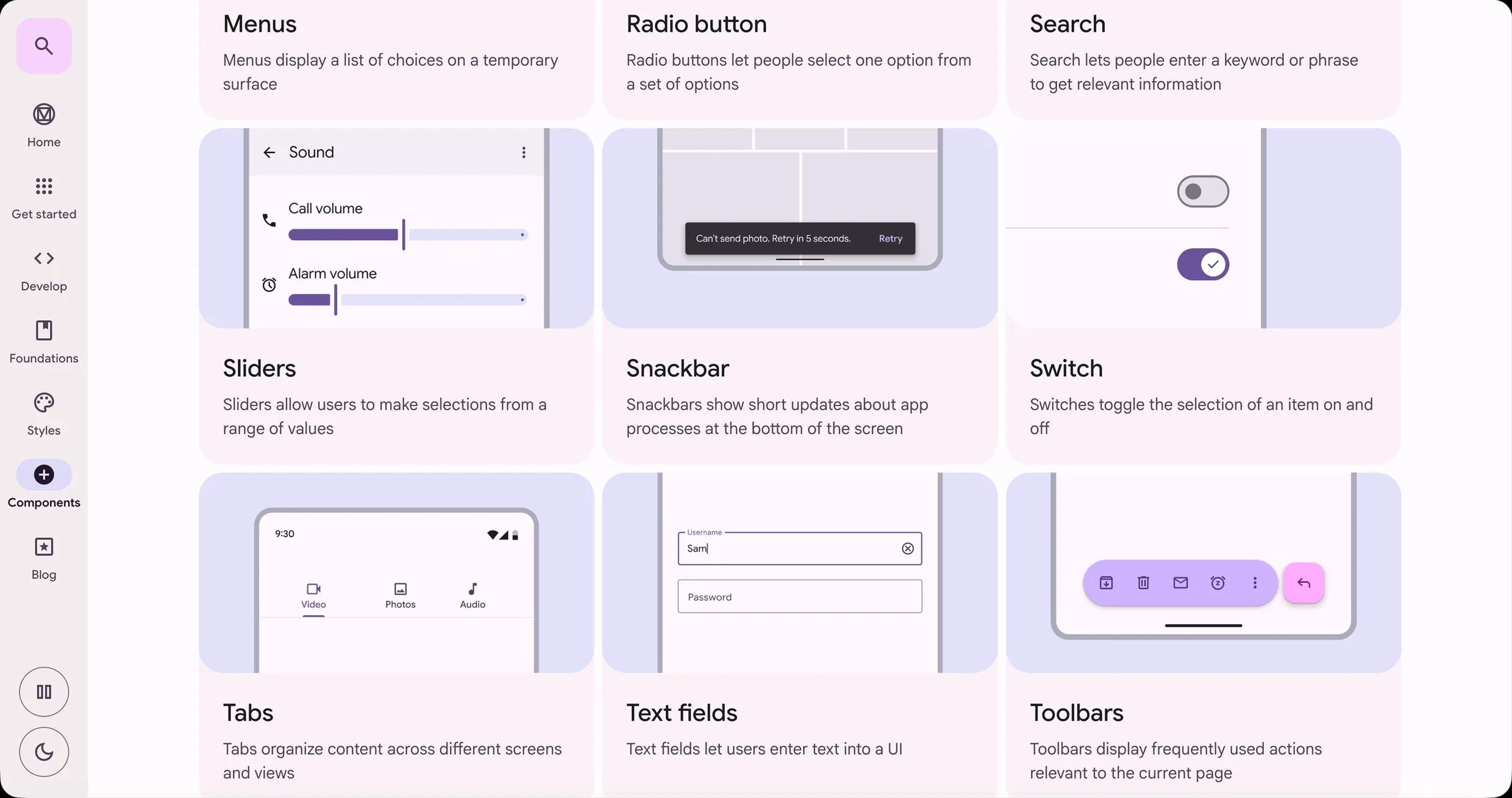
The second was the tool. Figma didn't invent the sameness, but it made copying frictionless, and cheap imitation spreads in a way expensive imitation never could.
The tooling had been moving this way for thirty years. Photoshop ran the 1990s and early 2000s, and sites built from sliced Photoshop files were heavy, image-dense, and marked by whoever made them. Sketch and InVision, around 2010 and 2011, nudged the work flatter and more modular, and the component became the unit of design. Figma opened to everyone in 2016, was the default by 2019, and its real-time collaboration turned shared libraries into the obvious way to work. Then came the community tab, thousands of ready-made component systems a click away.
Tools have always shaped their output. What changed with the community libraries is that the tool arrived with other people's aesthetic decisions already loaded in, polished, and far quicker to reach for than anything built from scratch. In most sprints the job is to ship on time, and working out how the product should feel is a slower, separate task the tool was never built to hold.
At Config in June 2024 Figma launched an AI feature called Make Designs, then pulled it in early July after a developer, Andy Allen, showed its output cloning existing apps, Apple's own Weather app among them, on prompt after prompt. Dylan Field, Figma's CEO, put it down to commissioned design-system components added in the run-up to the conference that hadn't been vetted properly, rather than the training data. Either way, the incident exposed the mechanism. A system that generates designs from a given starting point can only produce more of whatever that starting point already holds.
Apple's Weather app, then Andy Allen's two posts reporting what Make Designs returned, then the three outputs themselves. Every weather screen places the city name at the top, a large temperature under it, the condition and the daily high and low beneath that, and an hourly forecast in a rounded container across the lower half.
 Apple Weather
 Andy Allen's post
 The demo he posted
 First attempt with Figma Make
 Second attempt with Figma Make
 Third attempt with Figma Make
The third was taste. Dribbble launched in 2009. By 2013 Paul Adams at Intercom had named the pattern, in a post called The Dribbblisation of Design. The work that did well on the platform looked spectacular at 400×300 and fell apart as an actual product. Designers were optimising for the surface they were being judged on, and that surface paid out for visual finish. For a generation of designers, visual finish had become the working definition of good.
The Dribbble look is easy to inventory. High contrast, a lot of white space, a sans-serif, a tight palette, soft shadows. The whole field settled on one look and copied it.
iOS 7 sped all of this up in 2013. Jony Ive, who'd taken over software design after Scott Forstall left at the end of 2012, made the case that people were comfortable touching glass by now and the skeuomorphic scaffolding had done its teaching job. Within a year flat design was everywhere, and not because every team had reasoned its way there alone. Apple had redefined what current looked like, and enough people followed the reset that it stopped being a choice.
By now the three shifts reinforced each other. The platform set the range a product could occupy, the tools made stepping outside it slower and more expensive, and taste culture rewarded whoever stayed put. The first three made copying the rational choice. The fourth, automation, made it instant, and made copying part of making.
AI design tools learn from the web that already exists. Prompted with “a clean, minimal SaaS dashboard”, a model returns the most probable version of that phrase, which is to say the most common one, the thing the industry spent fifteen years converging on.
The most probable dashboard is the average of every dashboard that came before it. No tool chose that outcome. It is only what optimising for probability produces.
These tools generate a first pass for a user to refine, and that first pass does more than it appears to. It sets the aesthetic frame the rest of the session happens inside. Someone without a settled view will tweak what the tool produced rather than throw it out. Blue becomes green. Padding goes from 24px to 20px. The decisions that actually mattered were already made before the session opened.
Claude Design, out in mid-April 2026, makes the pattern easy to see. During onboarding it reads a team's existing codebase and design files, assembles a system out of them, colours and type and components, and applies it to everything that follows. Consistent branding at speed is useful, but it comes with a problem. If the existing system was stitched together from community templates, Claude Design carries that inheritance faithfully across everything the company ships next, with no way of telling a deliberate decision apart from an inherited one.
Figma's own AI features work the same way, as do v0 and Cursor's UI generation. Each reads what is already there and produces more of it, faster, treating the starting point as given. On 14 April 2026 Mike Krieger, Anthropic's chief product officer, resigned from Figma's board the same day The Information reported that Anthropic's next model would ship with design tools aimed squarely at Figma's market. The fight is over this exact ground: who gets to build the infrastructure of aesthetic decisions, and how much of it disappears from view for the people working inside it.
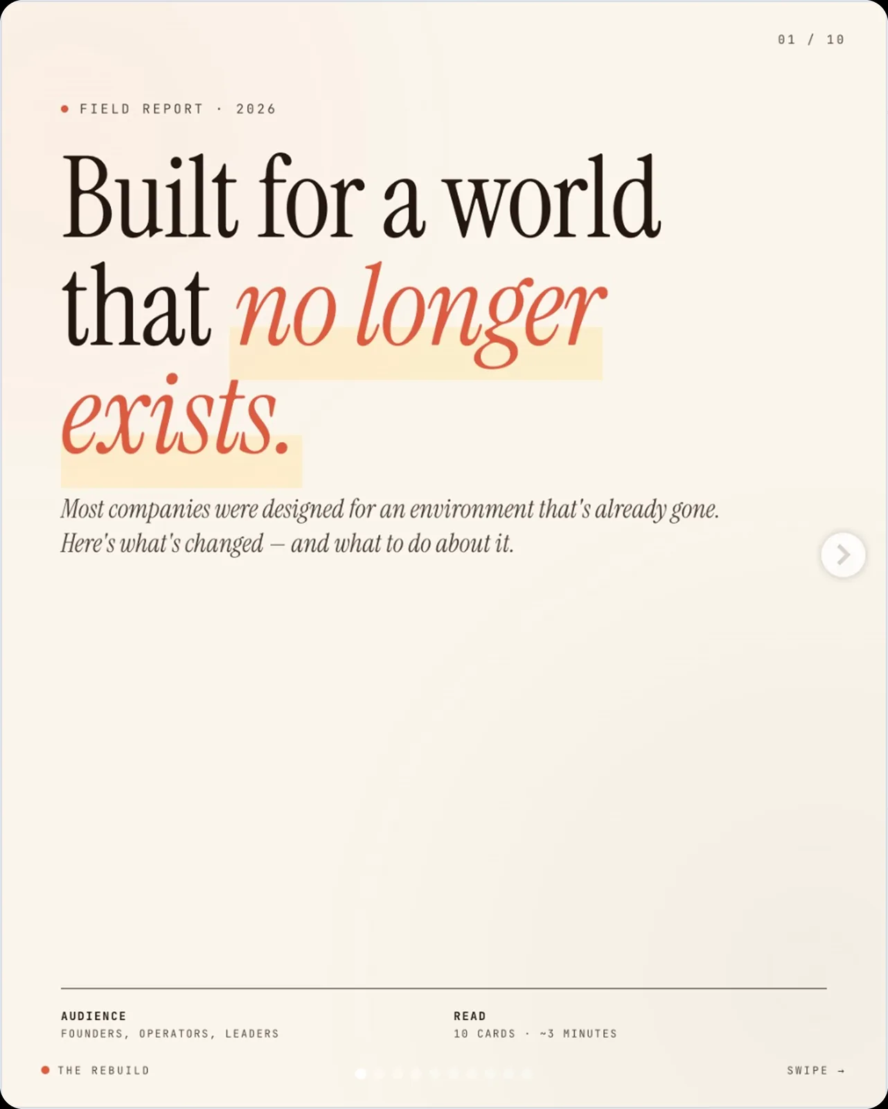
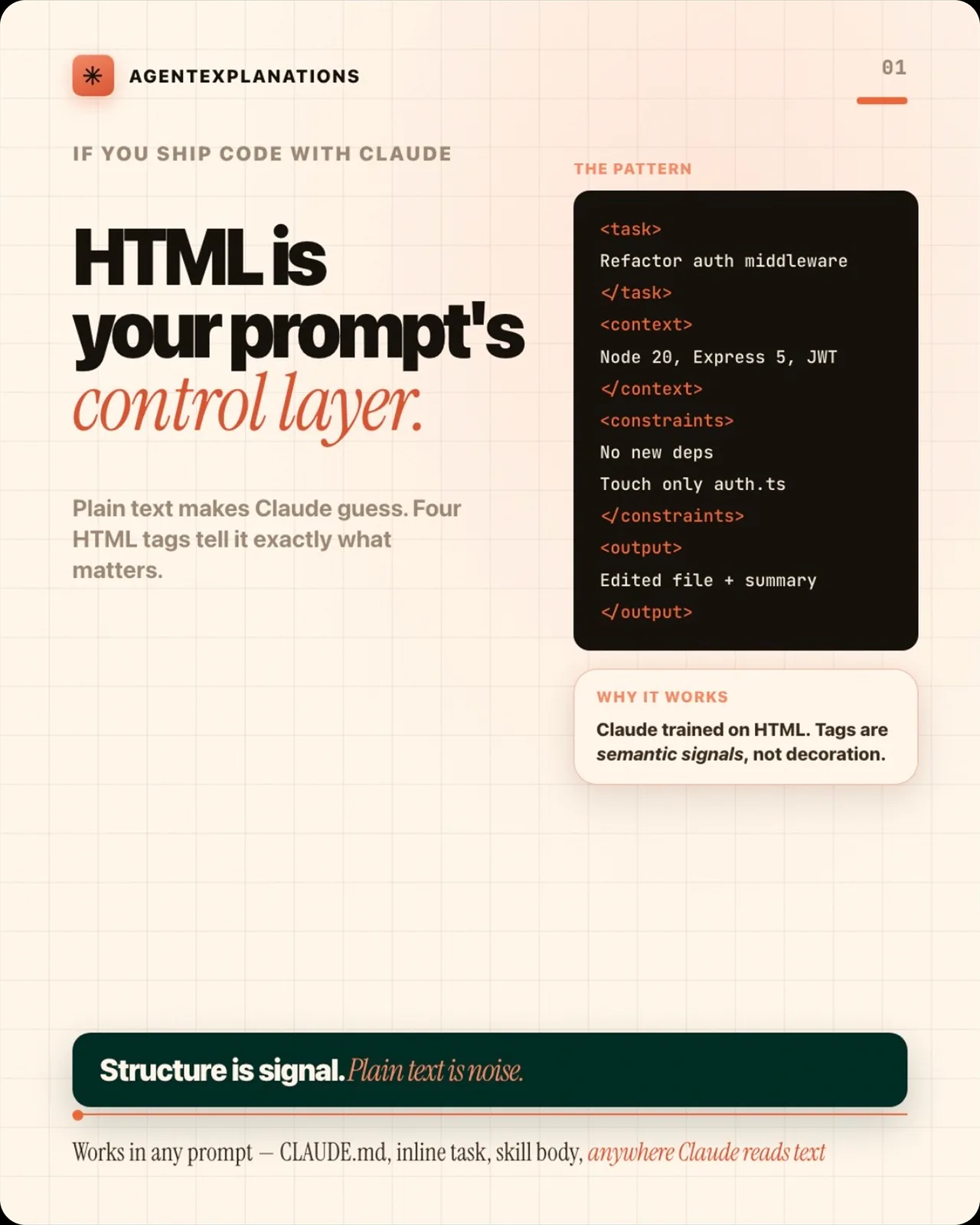
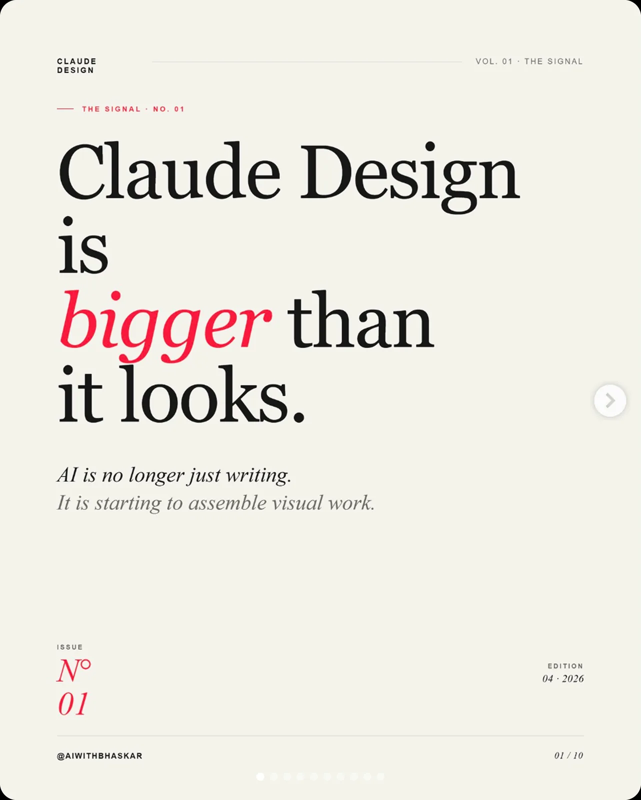
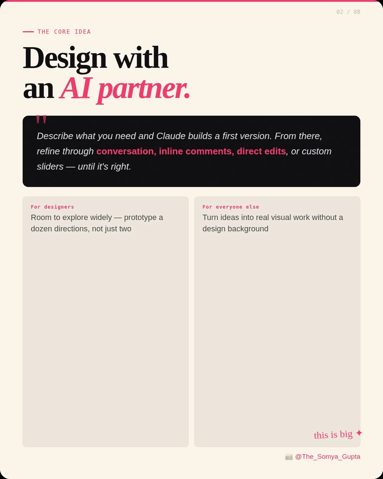
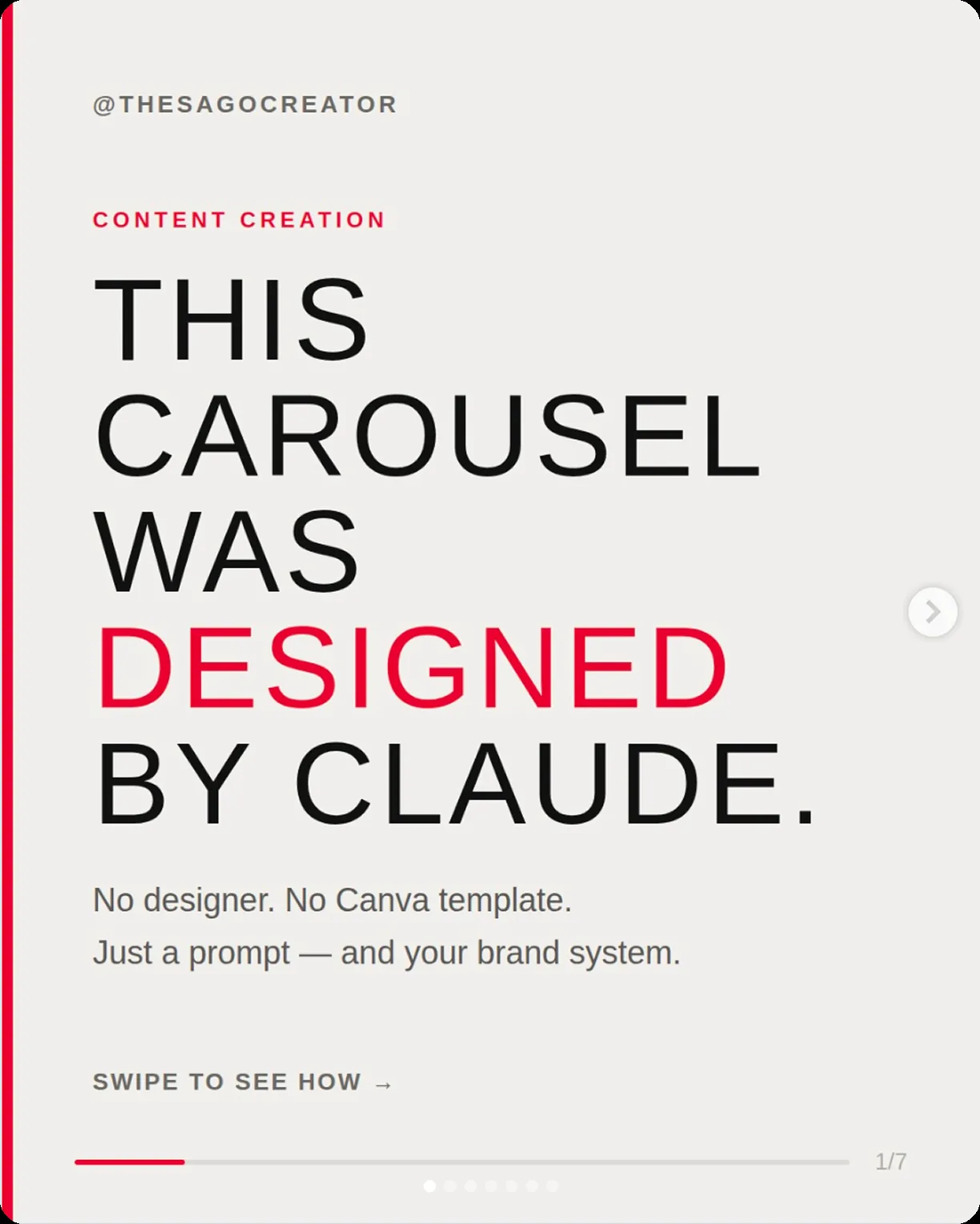
In the weeks after Claude Design shipped, one carousel layout began recurring across Instagram, TikTok and Threads, posted by creators with no link to each other. A warm cream ground. A serif headline with a single word dropped into italic and one accent colour, coral or pink or rust. Monospace labels set small above each section. Numbered cards on a grid, a page counter in the corner, a swipe cue at the foot. Bill Cava had already traced that same grammar to the tool's own default house style. The carousels were that default loose in the feed. The subjects had nothing in common, folder structure for Cowork, how to format a prompt, the ways companies fake an AI strategy, the launch of Claude Design itself. The frame stayed put while the content changed underneath it.
Six opening slides from unrelated social accounts. Five share a warm cream ground, a serif headline with one word set in an accent colour, a small tracked label above it, a page counter in a corner and a swipe cue at the foot. The sixth keeps the same furniture in a sans face on grey.

The signal in the noise
The old web wasn't better. Cameron's World, that lovely archive of 1990s personal pages, is a curiosity rather than a model. Early Amazon was hard to use. MySpace was chaotic in ways that cost people real time. Nobody should want software to look like 1999.
Software used to look like a great many different things, and that difference carried information. Back when interfaces didn't resemble each other, a product's visual language said something about who'd made it and who it was for. How dense the layout was, how heavy the type sat, how freely colour was used, all of it readable. The way a product looked was an argument about what it was.
Rakuten and Yahoo Japan still work like this. Both run on visual logic nothing like their Western equivalents: high information density, typography shaped by the structure of kanji rather than the Latin alphabet, navigation that assumes a different idea of how someone moves through a page. To an eye raised on Dribbble they look overwhelming. They come out of a different cultural and typographic tradition, and it shows in everything down to the grid.
A converged aesthetic shows only that the team had the same libraries open as everyone else. Once the way a product looks stops setting it apart, what's left to compete on is the writing, the brand voice, the way the thing behaves, and visual design, what most designers spent years getting good at, gets pushed out of where products now compete.
Exceptions, and what they disclose
A few products don't look like anything around them. Arc is the current example, and the small Mac studios of the early 2000s are the historical ones, Panic and The Omni Group and Bare Bones Software.
Panic made software that looked like Panic made it. Particular colours, a particular take on iconography, interfaces that showed care down to the pixel. They could keep it up because they were building for people who noticed, developers and power users for whom the craft was part of what they were buying.
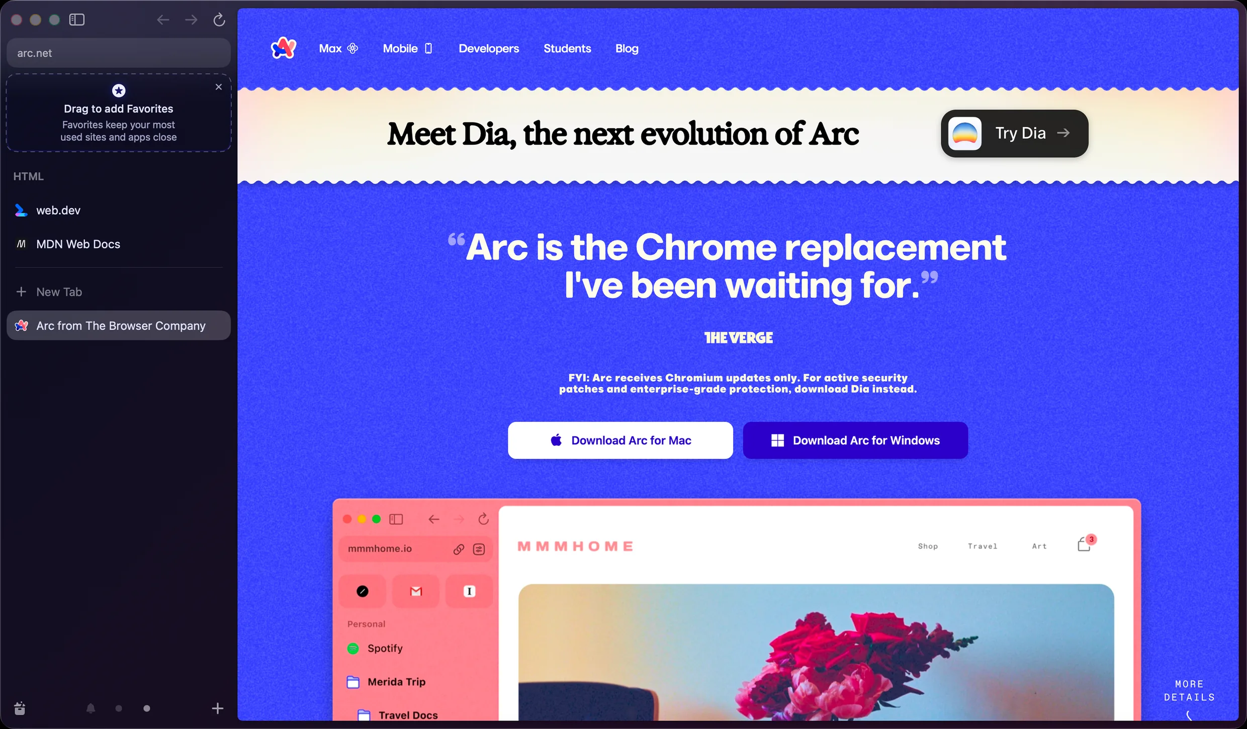
Arc rearranged the visual logic of the browser itself. Navigation in the sidebar, spaces, almost nothing where convention said it should be. Every one of those was a decision about who the tool was for, people who found the existing browsers stale and were willing to relearn the basics for something that felt built on purpose, and it held all the way through.
This does not take rare talent or a bigger budget. It takes a point of view that was in place before the first component went down.
None of it looked like it came out of the Figma community tab, and the difference showed before any of the reasoning did. The sidebar was the first thing on screen, so the decision about who the browser was for had already been made by the time a tab was open.
Before the prompt
None of this is an argument against design systems, or Figma, or AI tools. The infrastructure exists because it solved real problems at real scale, and most of the calls that built it were reasonable on their own. It's an argument about when the aesthetic judgement happens, and what shifts when that moment gets moved.
Under the first three shifts a designer could still form a view while doing the work, sketching, weighing one component against another, looking at a reference and deciding it wasn't quite right. AI-first work moves that moment. The first version turns up before the opinion has formed, so the frame is set before the conversation begins and the refining happens inside an aesthetic the designer never chose. The judgement has to come earlier than it used to, before the prompt is typed or the library is browsed, when the question that matters is how the thing should feel and not only how it should look. The community tab has no answer to that.
Every component in a system was a decision. Someone set its hierarchy, its density, its colour, its motion, under real constraints, for a particular product, on a deadline. Adopting it without asking why it's shaped that way doesn't sidestep that decision. It moves the decision upstream, to whoever made the component first, and ratifies it without comment. The AI-first tools make that ratification automatic, reading the files, building from them, passing the inherited decisions downstream faster than anyone stops to examine them. The default was always a design decision. Someone made it upstream, and everyone who builds on top inherits it without asking why.